Tuesday 23 November 2010

3 double page spreads.

 This double page spread is from NME.
L- I think the layout of the double page spread is a really good way of showing who is being talked about in the article. I think by using the pages as a photogra[ph with florence at the side of the aricle shows the artcile is about her.the cametra angle is slightly below her i think this gives the impression she is powerful .
I-the instiution of the magazine is nme which is produced by ipc.
I-i tyhink the messgae behing this article is floerence this that the USA has got the love however florence has a song called "youve got the love " so mabie this means  as nme is an american based magazine mabie its saying that nme have the love for florence.
A-the audience for this magaziene is people who like florence and the machine and peiople who religiously buy this magaizne every week i think the magaizine is amined at possibly teenagers  male and female
R--by looking at the doble page spread  i think it look like the magazine is represdenting the usa howver i think it is represing floernce and her love for america therefore i think it also represents the audience as ameicans  having love for music.
This is a double page spread from Kerrang
L-I think the layout of this double page spread is really busy and crowded with images of the band. i think way kerrang have set out the double page spread is a good way of showing who the article is about.on the main image the camera angle is a midshot the reason i think kerrang did this to the article is because they wanted to show the emotion in the artists face. however there are other small inserted images 2 of the images are close ups and the ther one is a zoomed out image of the band.
I-the instituion is kerrang which is produced by BAUER
I-the message behind this double page spread is as a band MCR  are trying there best to be the best band they can be.
A-i think the target audiecne in this magaizine is males and females who like my chemical romance and who are probibly aged between 16 upwards.
R-This magazine represnets my chemical romance and i think it might represnt there fans who aspire to be like the band .


Language-the layout of the magazine is very organised, the tilte takes up half the A4 page situatted on the right hand side of the page kerrang also do this, the photograph takes up the whole page and there is also a sun like picture situated in the article this might be to give the impression of mabie america as its usually always sunny and the people from america are well known for having small pampered dogs.it could give the impression to thee audiecne all femal djs are "Lame" or dont really care about the music just the glamourous lifestyle.
Instition-this magazine is called mix mag it is published by ....this particaular double page spread it set out across two pages and the majority of the page is a photoograph then fetured in the right hand corner there is small article of what the title "welcome to lame academy"is all about. the reason the main title welocme to the lame acedmy stands out is because there is a bright colour behind the writing which is very eyecatching to the reader, it also takes up half an A4 page therefore this makes it clear to the reader where the title is.
Ideology-in this double page spread the title welcome to the lame academy i think is an abrevration of the fame acemey as we can see from the article the celeb in the picure she looks very glamourous she looks followed from the papartizi.Mix Mag is a weekly magazine for people injoy dj and dance music.
Audience -i think the audience for people who read mix max is people who enjoy dj and dance music or people who aspire too be a dj.therefore i think this magazine is more for males then females howevr some females may be interested in this magzine i think the age range is about 16-20 i think the magazine is aimed at students as the price is fairly cheep at the price of ... i think this also influences the audience
Rrepresentation: i think mix mag represnets females by making the audience think all celebrity djs care about is how they look and how they represent themselves in the media.


Friday 19 November 2010

LIIAR on contents pages

         
L-The layout on Q magazine is relatively organised compared to kerrang.The magazine Q has a house style on every page. The contents page has been planned out carefully including the positioning of the text and images.
I-the institution of the magazine is Q it is published by BAUER.
I-this magazine is aimed at people who like quality and obviously the magazine is called Q which could signify quality as an audience we see the quality of the magazine is very good as the magazine is coated the front page.
A-i think the type of audience who would buy this magazine is people who have the money to spend £3.99 on a magazine.
R-this magazine is represented as a smart magazine, it is set out neatly and it has all the media elements.


L-the title is featured at the top of the page the picture is of center and the text is at the sides and the bottom.this is a typical contents page i think the contents page has been planned out well and i think the organisation of the contents page is good.
I-the institution of this magazine is NME it is published by ipc
I-This magazine is aimed at people who  are probably students so the cost of the magazine needs to be fairly low so they can afford to buy it. i think the message behind this contents page is that the magazine is there to provided great information on gigs and music festivals ect
A-I  think the audience who would buy this magazine is people who have a passion and like for this type of music magazine. I think the audiecne will most probably be students male and female aged from 15 upwards.
R-I think this contents page represents music and music venues however i think it also represents its readers as people who enjoy music looking at the font of the contents page it looks like it is representing people who like soft rock / rock bands.


L-The layout of this contents page is very simple however i think it is very over crowded and looks really busy i think kerrang have done this because by making it look busy makes it look eye catching.
I-The institution of this magazine is BAUER the same company as Q,i think BAUER produced who magazine s of generally the same genre because they may have wanted to have one magazine of a good quality which is expensive and one at a low quality with a small price because then they get more readers and more buyers and they earn more money.
I-i think the message behind this contents page is MY CHEMICAL ROMANCE is back they have been away for a couple of years but they are back now with a new sound for there fans. i also think the message behind it is all the old bands who were big eg my chemical romance and green day and now back .
A-I think the main audiecne who buy this magazine is people who like rock music male and females probably aged 16 and upwards my reason for thinking this is because people who are 14  probabily never listened to my chemical romance when they werre well known, were as people who are 16 probabily listened to them .
R-


Tuesday 9 November 2010

research of 3 magazines (front pages)


L-the camera angle is at a low angle the reason i think, the company of this magazine did this is because they wanted to give the male on the front of the magazine a sense of being powerful and dominant. The magazine front page also has a house style Kerrang's front page layout is the same all the time it always has the same mas head.
I-The institution of the magazine is Kerrang however it is published by Bauer_Verlagsgruppe, the reason i think they made this magazine is because the know it will sell the company know there is a group of people who will buy this magazine because of the music which is listed in the magazine.
I-kerrang issues a new magazine every week.therefore their audience gets news fast and at a cheep price.i think this front page shows a message that the magazine is for people who like the sort of bands who are on the front cover and for people who agree with he statement which is stated at the top right of the magazine "Life is loud".
A-i think the Target audience for this magazine is mainly students and people who don't have much money to spend on expensive magazines as the magazine is only £2.10.This magazine would probably relate more to the male gender than the female because the layout of the magazine just looks like it would be for a male magazine.
R- This front page represents its audience as people who aspire to be more like the male on the front page.


L-This magazine front page shows a medium close up shot the reason i think the magazine company have done this is because they wanted to show the expression on the Jonas brothers faces.The rolling stones magazine has a house style the background is usually always white and has a red title with a black and white outline.
I-Rolling stones magazine is produced and founded by Jann Wenner she founded the magazine in 1967.
I-as the rolling stone magazine  is a weekly magazine the news is reported out to it audience fairly quickly  and the paper which it is printed on to is a low quality . However if it was a month magazine it would have more quality. the paper quality would be better and the information in the magazine would be better because the magazine company would have a full month to get lots of celebrity information.
A-I think the main audience for this magazine is teenage girls because the Jonas brothers are well known for movies such as camp rock 1 & 2 which is targeted at  a younger audience they are also know for there album -lines vines and trying times and for their movie the Jonas brothers concert live.
i think young teenage girls around the age of 14-16 are going  to buy this magazine because of the Jonas brothers been on the front page
R- The front page represents its audience by young teenage girls wanting to know the ins and outs of a celebrity lifestyle and what its like inside a Jonas brothers life.


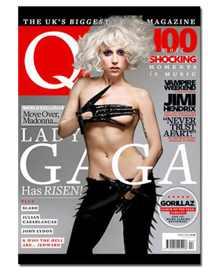
L-think this magazine shows a medium close up shot.the reason i think the magazine company did this was to show the audience the fresh new face and new appearance of a new artist, i think they also did it to show the emotion and facial expression on Lady Gagas face. The magazine Q has shown they have a house style by there title which  is always the same i know this because i saw an image on http://www.google.com/ which showed my lots of different font pages of Q magazine . this shows that Q magazine have a house style which they stick to.

Q like old rockers


I-Q is produced by Bauer it was first issued in October 1986.
I- Q magazine is a monthly magazine therefore the quality of the magazine is very goo. the paper is photographic paper
A-I think the audience for this issue of Q is lady gaga fans, so i think the gender is mixed because she appeals to both genders because she is a controversial artist both genders like her music.her fans are usually aged at about 13 upwards.however this magazine is Q it is monthly and its expensive it is priced about £3.99 therefore teenagers probably wont spend £3.99 on a magazine  so i think people who are in work and have a secure job will probably buy this magazine.
R-i think Q represents Lady Gagas outburst in the music industry.i think it represents the audience wanting to know who lady gaga is , where she came from, what she is going to be known for,  and her wild taste in fashion . The subheading say moveover Madonna LADY GAGA has risen this could mean lady gaga is going to be represented as the new Madonna.


Friday 5 November 2010

L.I.I.A.R

L-language-camera angle,layout,imagery,conventions,codes,researching other magazines, researching  consistency in magazines positioning of the camera , distance.

I-institution-who produced the magazine and why, media texts are made to make money, synergy.

I-ideology-values,messages, morals,eg

  • NME news fast it comes out every week  its cheep and  the paper quality isn't very good 
  • Q-it comes out monthly its expensive and the paper is photographic paper 

A-audience-defining my target audience age, gender, social class

A-upper middle class - doctors, media consultants highly paid jobs
B- middle class- teachers,police,surveyors
C1-lower middle class-lower civil servants
C2-skilled working class-brick layers, plumbers electricians
D-working class,mcdonalds workers , shop assistants
E-underclass ,unemployed ,pensioners, students

R-representation - representing my target  audience by using my front page to aspire to be like whoever is on the front cover .
re-presenting images and values  presenting society back to us makes us want to be like the person on the front page
synergy

brief for music magazine

i am going to be making a magazine cover,contents page and double page spread  for a music magazine , i will be anaylsising three different college  magazines to use learn more about how the magazine uses all the conventions.i will be developing different ideas for my magazine which may include : 

  • photographs
  • research
  • different texts
after the development of my ideas i will be drafting out my magazine  front cover  contents page and double page spread i will be doing drafts by hand and computerized drafts, i will also complete mind maps to show my planning 
my front page will contain :

  • a masthead
  • a main image 
  • cover lines 
  • price
  • a barcode 
  • a date line 
my contents page will include page details i will also put small images on there to make it more interesting

my double page spread will either be an interview or a new discovered band or solo artist article.